
Betfred Super League 2025 Kits Review
As the Betfred Super League prepares to kickoff this week (13 Feb), every kit has now been launched by the respective clubs.
Here is a far from comprehensive ranking of each team strip ahead of the 2025 season.
(Shoutout to Rugby League Jerseys for their comprehensive database of previous designs)
Castleford Tigers
The Tigers went back to a lighter shade of orange after a decade in darker hues last year, and they’ve returned to that theme with this season’s design.
Whisper it quietly, but the striped tiger pattern is reminiscent of nearby Hull City FC’s design, as Yorkshire brand Oxen enter their fourth season as manufacturers.

Image: Castleford Tigers
The away kit opts for a pink geometric design reminiscent of some seriously funky floorboards, a big departure from last year’s green effort.
Shirt sponsor CBR Engineering enter a staggering 11th season on the front of the kit, still based in Castleford: almost quaint in this day and age. The Bullseye-esque logo on the front right belongs to Benidorm-based pub chain Yorkshire Pride.
Rating: 7/10
Catalans Dragons
France’s foremost rugby league outfit opt for evolution rather than revolution, as the ubiquitous red and yellow ribbon remains emblazoned at the top of a white shirt.
What sets it apart is the Guy Fieri-esque flame pattern on the livery... because Dragons.
The shirt sponsor has also been removed from the middle, although plenty of visual clutter remains on the shirts and shorts.

Image: Catalans Dragons
The fittingly named Macron also delivered an away kit, with interesting shades of highlighter pen green and chalkboard grey accompanied by what can only be described as a mispainted road marking.
Their alternate third kit opts to do away with the stripes in favour of a very American design, with the team name emblazoned across the chest of a single vertical line with a mixture of home and away colours.
Rating: 6/10
Huddersfield Giants
Another Oxen Sports effort for Huddersfield too, with a nice three-quarter design in maroon and yellow.
Last year, they went for thin horizontal stripes: this has been superseded by a very subtle patterned design on the yellow part of the shirt.
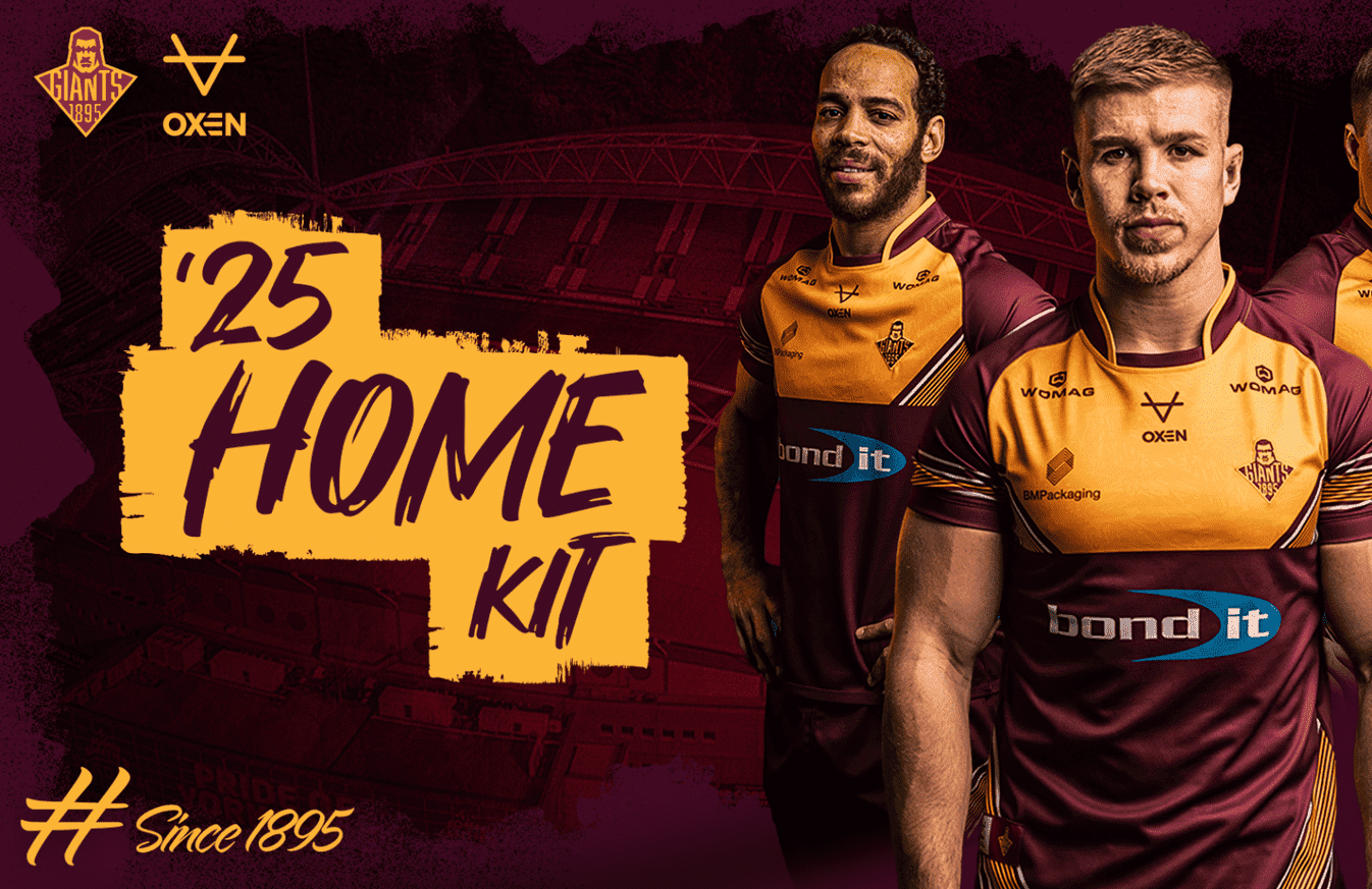
Image: Huddersfield Giants
The away shirt might look like your device has a crack in it, but the black tree branches sitting aboard an azuric colour scheme suits it well.
There is also a return for shirt sponsors Bond It, self-described as UK ‘a manufacturer of a wide range of building and construction materials’. No AI technologies or crypto companies in Huddersfield!
Ranking: 7/10
Hull FC
It will come as no surprise that Castore – in year two – have gone traditional for the Black and Whites.
The only notable changes from 2024 are that white has once again reasserted dominance over the black, with radiator manufacturer Ecostrad having a slightly smaller billing.
Where Hull really pick up brownie points is with their alternate kits, which they have two of rather than a conventional away design.
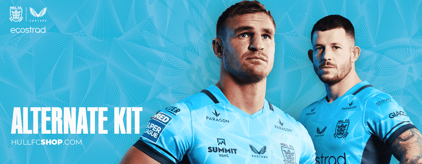
Image: Hull FC
The ‘first alternate’ looks like a pillow from a high-street store’s summer range, with the wavy grids matched with the underside of a pool.
The ‘second alternate’ is a lot more industrial, with graffiti splashes and grungier aesthetic, but comes decked in a regal gold trim fit for a king.
Rating: 8/10
Hull KR
Across the ‘Hullywood’ divide, last year’s agonising runners-up Rovers are in safe hands with another Oxen layout.
After a dally with mainly red designs, last year saw white back in. This continues in 2025, with a red mayoral sash suddenly appearing across the white plains of the shirt.
Hull-based broadband provider Connexin are also back, very much the yin to KCOM’s yang at Hull FC, although the cloud design doesn’t work terribly well on a white background!

Image: Hull KR
The only colour more royal than gold, as adopted by Hull FC, is purple; Rovers go with some lock-tight tiny molecule patterns across their alternative shirt.
Their third strip looks distinctly French, with the tricolore visibly present. Shoutout to the gradually thinning hue of the red stripe, though.
Rating: 7/10
Leeds Rhinos
Have a guess at the colour of Leeds’ kit. No, go on, guess... Why yes, it is yellow and blue. No, you don’t get any points!
This does actively mark a change back to the more traditional design, as last season’s white kit – and the darker blue of 2023, in fact – are swept aside by the design most closely associated with the Rhinos.
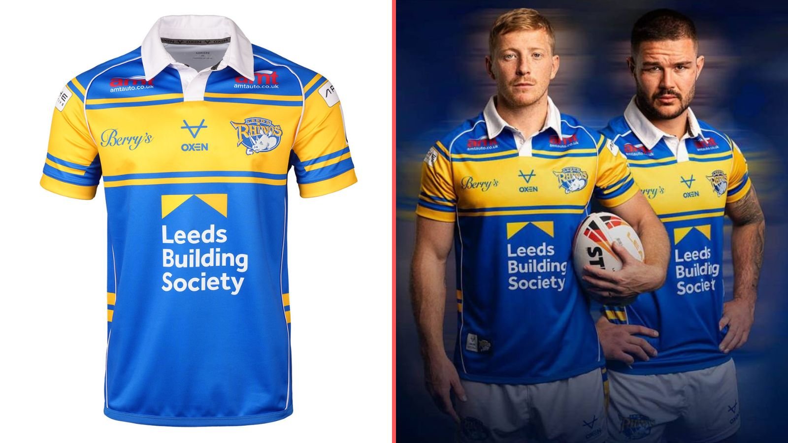
Images: OXEN Sports and Leeds Rhinos
With Leeds Building Society closing in on 20 years as principal sponsor, Leeds fans must have a sense of both déjà vu and excitement at seeing their side in the classic outfit.
On the flip side, the alternative kit is a triangular effort with more than a hint of Toblerones about it.
The random blue trim on the sleeves is a bit unexpected, but adds a layer of colour to an otherwise sober attempt.
Rating: 7/10
Leigh Leopards
As has been the case over the past few years, there is so much to say about Leigh’s efforts.
First and foremost, a firm welcome along to Reebok, who become possibly the biggest name to make a Super League shirt in its history.
So, the design. Not as garish as the infamous 2023 ‘staring cat’, not as dark as last year’s uniform, but still a sight to behold. ‘Leopard-print meets lipstick smear’ is the only way to describe it, really.

Image: Leigh Leopards
Another welcome to Jet2 Holidays, who take over on the front of the shirt for the first time. Let’s hope this doesn’t mean Jess Glynne’s ‘Hold My Hand’ plays before every Leigh home game...
The away design returns to the ’staring’ motif, albeit harder to detect compared to 2023. I’m sure Leigh will be hoping this leaves their opponents ’black and blue’ as well.
Rating: 7/10
Salford Red Devils
The Devils have gone a bit pastoral with their home kit this year.
Based on the design of Salford Cathedral, it is undeniably majestic, but does come across as rather slapped upon an ordinary VX3 template.
The University of Salford make its bow on the front of the design, meaning the only thing that could make it more Mancunian is the Coronation Street sign in an L.S. Lowry sheen.

Image: Salford Red Devils
Keeping up the Salford theme, the away strip is supposed to resemble an aerial map of the city’s shipyard on the docks.
Sadly, it looks more like a group of unfinished scaffolding randomly placed upon a shirt, albeit with the still-regal gold trim.
Rating: 5/10
St Helens
Like with Leeds, The Saints aren’t exactly a difficult team to predict with their design.
This is basic by the standards of the ’red V’, but there are flourishes: the holographic club crest, staggeringly in the middle, along with the faint diagonal lines and embroidered ’SH’ within the red.
Still let down by Home Bargains being the chief sponsor, but it is a local company: the same applied during their sponsorship of Tranmere Rovers a few years ago.

Image: St Helens
If you were in any doubt you were facing The Saints, the alternate kit spells it out for you beyond confusion.
The logo positioning leaves a bit to be desired throughout both looks, especially the hastily added bottom of shirt partner, but it ultimately serves the mandate to represent St Helens faithfully.
Rating: 6/10
Wakefield Trinity
A very welcome return for Wakefield to the Super League after their storming Championship sojourn last year.
Little-known Ellgren give another blue and white V-chested attempt, with the subtle Trinity emblems in the blue section, rather abruptly interrupted by the sponsor.

Image: Wakefield Trinity
Simple but effective, this is probably the most recognisable Wakefield aesthetic for many rugby followers.
The away shirt is a total photo negative, identical but colour-flipped. No-frills for sure, but clean and fairly uncluttered.
If anything, it is nice to see Wakefield competing at the top level once more.
Rating: 6/10
Warrington Wolves
Darts overlord Luke Littler turned out for the launch of his hometown team, as the Wolves make a big call and relegate blue to second-place.
Disturbingly yellow by the Wire’s standards, with the mostly blue effort from 2024 contrasted with virtually its complete opposite.
The Hoover redesign has also seen the sponsor freed from its circle and now left hanging on its own.

Image: Warrington Wolves
Whilst there have been some dips into yellow recently, this ranks amongst the most atypical choices for Warrington since the 1990s.
The launch of the alternate kit made the fatal error of placing a vastly more interesting background over a pretty stolid mixture of magentas and purples with patterns combined in hope rather than expectation.
There is also this Las Vegas inspired one - this year being the first in which America will host a Super League game – with the American flag prominently displayed and some more painted arrows underneath.
Rating: 6/10
Wigan Warriors
It’s fitting that we end with arguably the greatest side in Super League history, as Wigan look to make it three consecutive titles after last year’s unprecedented quadruple.
As you can imagine, the home kit has a sense of familiarity to it, with the only developments being the addition of some gold gradients below the standard red and white.
The away shirt is the sort of thing Tron predicted we would all be wearing in the future, blue chrome lines amidst a futurist backdrop.

Image: Wigan Warriors
There is also this very noble charity effort in partnership with Wigan & Leigh Hospice, which looks like a fading bus seat with some flowers stuck on the cuffs.
And, not wanting to be outdone by Warrington, Wigan’s kit for their Vegas clash takes the Americana theme and goes full on Uncle Sam: even the Kappa logo looks like one of the stars, and the Wigan red and white somehow translates seamlessly.
Rating: 8/10
So, you heard it here first: it’s Hull against Wigan for the fashion battle in 2025.